TheyConnect Branding
Client: TheyConnect
Role: Art director & designer
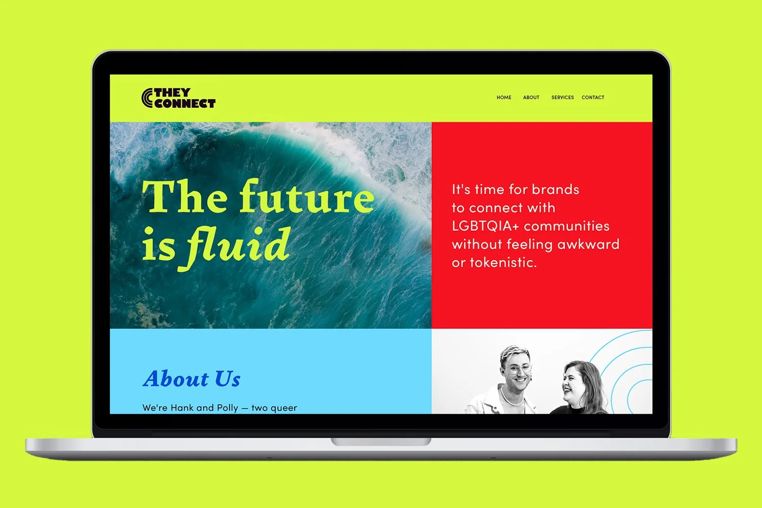
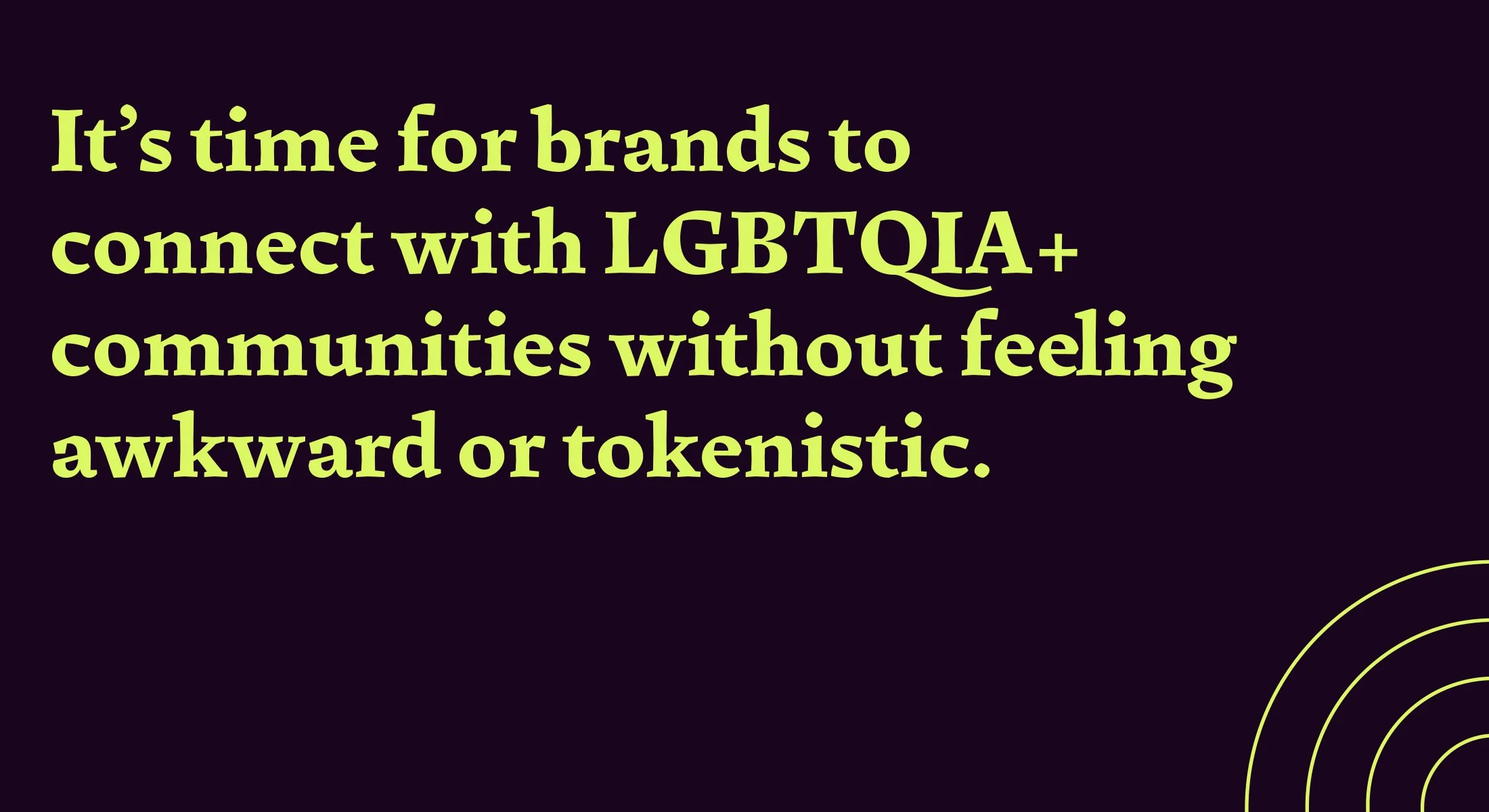
TheyConnect is a new consultancy that shares their expertise and wisdom to empower brands to connect with LGBTQIA+ communities. TheyConnect unites with advertising, marketing and media industries to equip them to talk to, and connect with LGBTQIA+ communities without feeling awkward or tokenistic.
TheyConnect is a fresh, approachable and authoritative front runner with industry-leading resources, training, and consultation to support the elimination of LGBTQIA+ discrimination.
I worked with TheyConnect to represent their values in a distinctive way. I created an identity and brand that showcases their uniqueness and approachability whilst maintaining a feeling of longevity, integrity and authority.
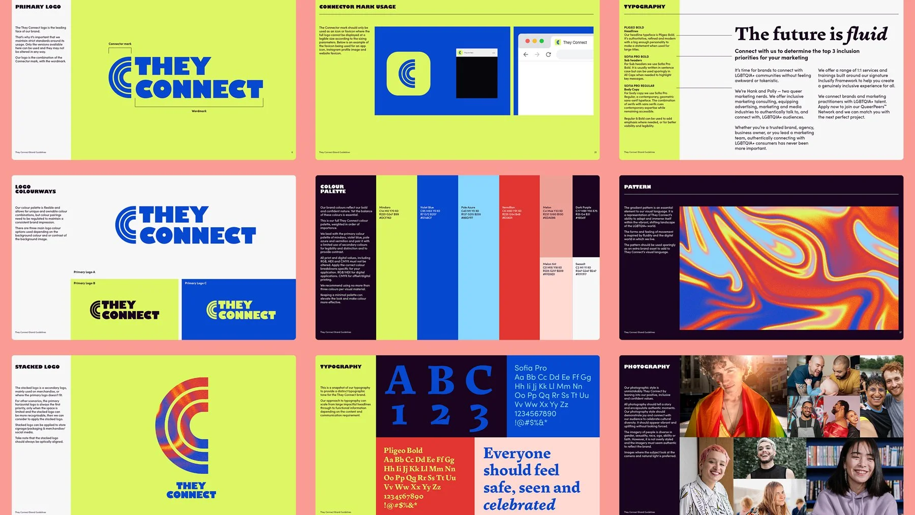
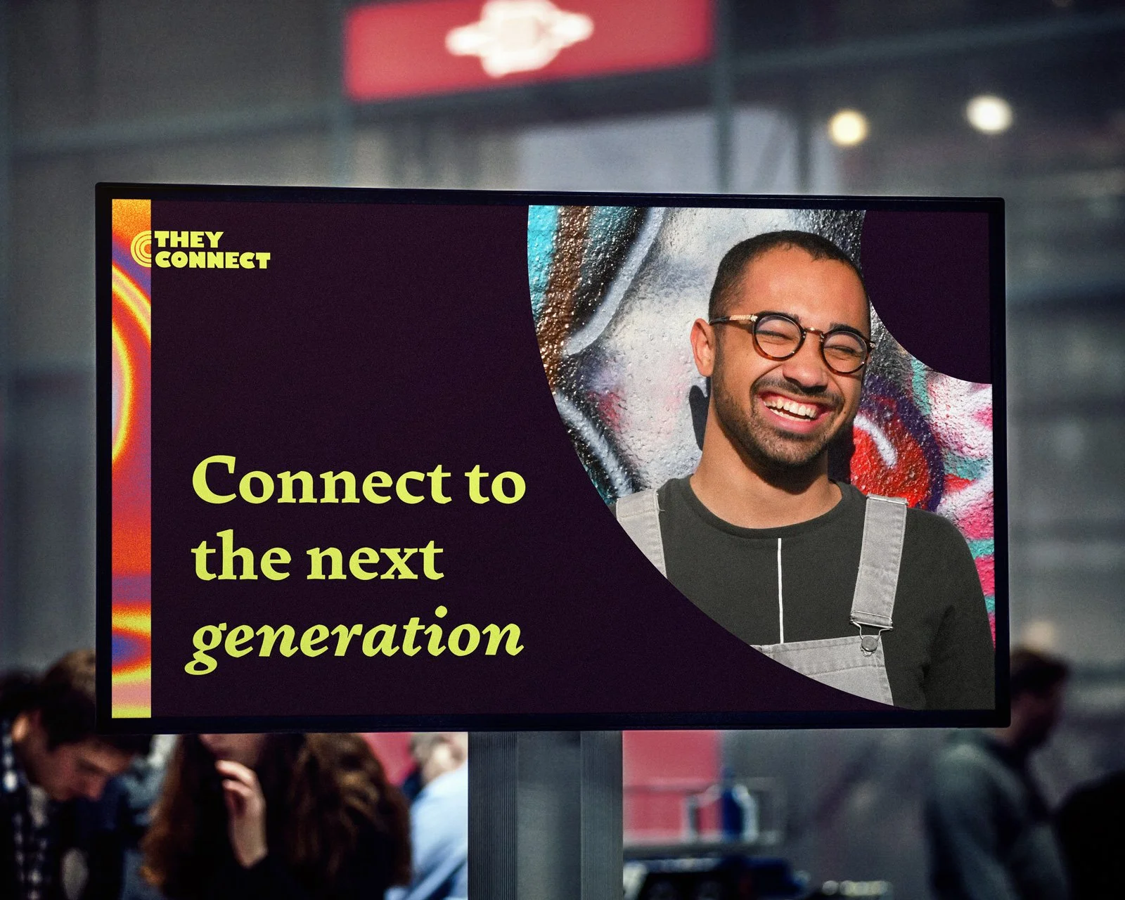
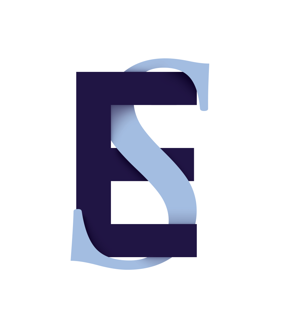
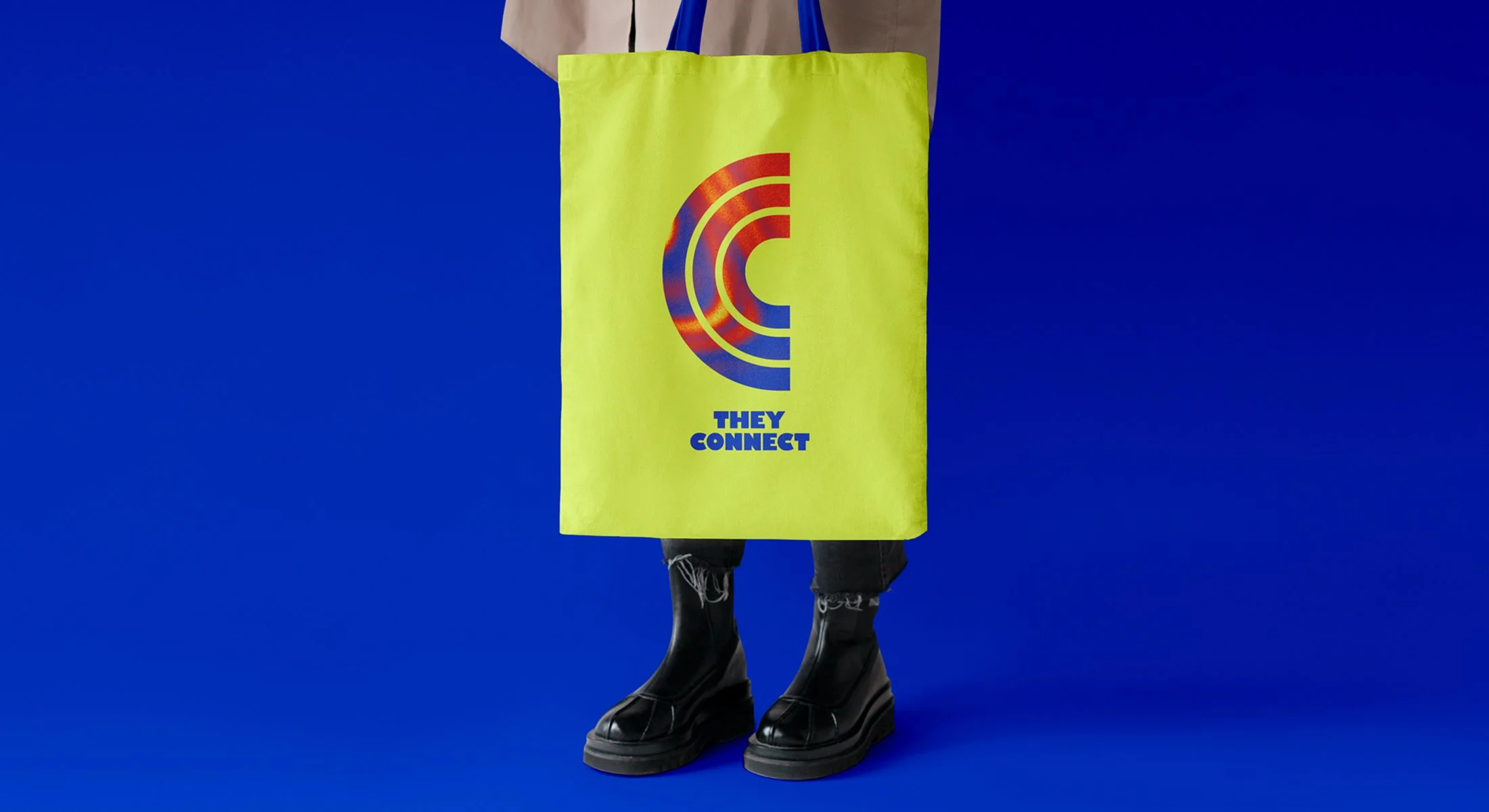
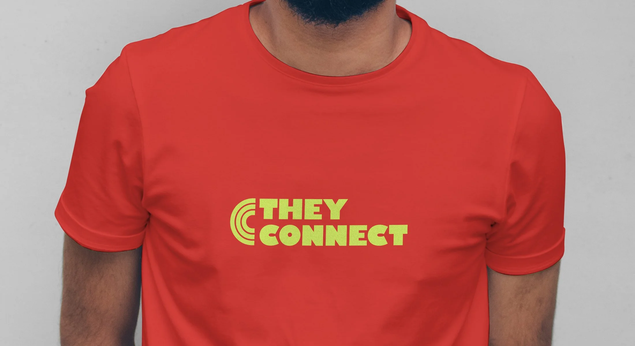
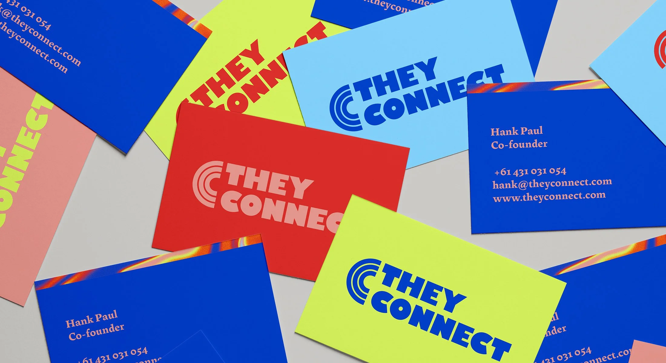
The logo has a unique take within queer culture, whilst having the authority of an established brand.
Gill Sans typeface in Ultra Bold is fresh, modern and evokes a feeling of warmth and personality.
The ‘C’ symbol works as a triple signifier. It is a connector between the words, ‘They’ and ‘Connect’. It’s also the classic rainbow motif turned on its side, as a reference to LGBTQIA+ community. It is also the letter ‘C’ which can be used on its own as a recognisable symbol.
I created a bespoke gradient pattern that is unique to TheyConnect. It is used as an essential element to the visual language, and a representation of TheyConnect’s fluidity and ability to adapt and immerse itself within the vibrant, shifting landscape of gender, inclusivity and media.
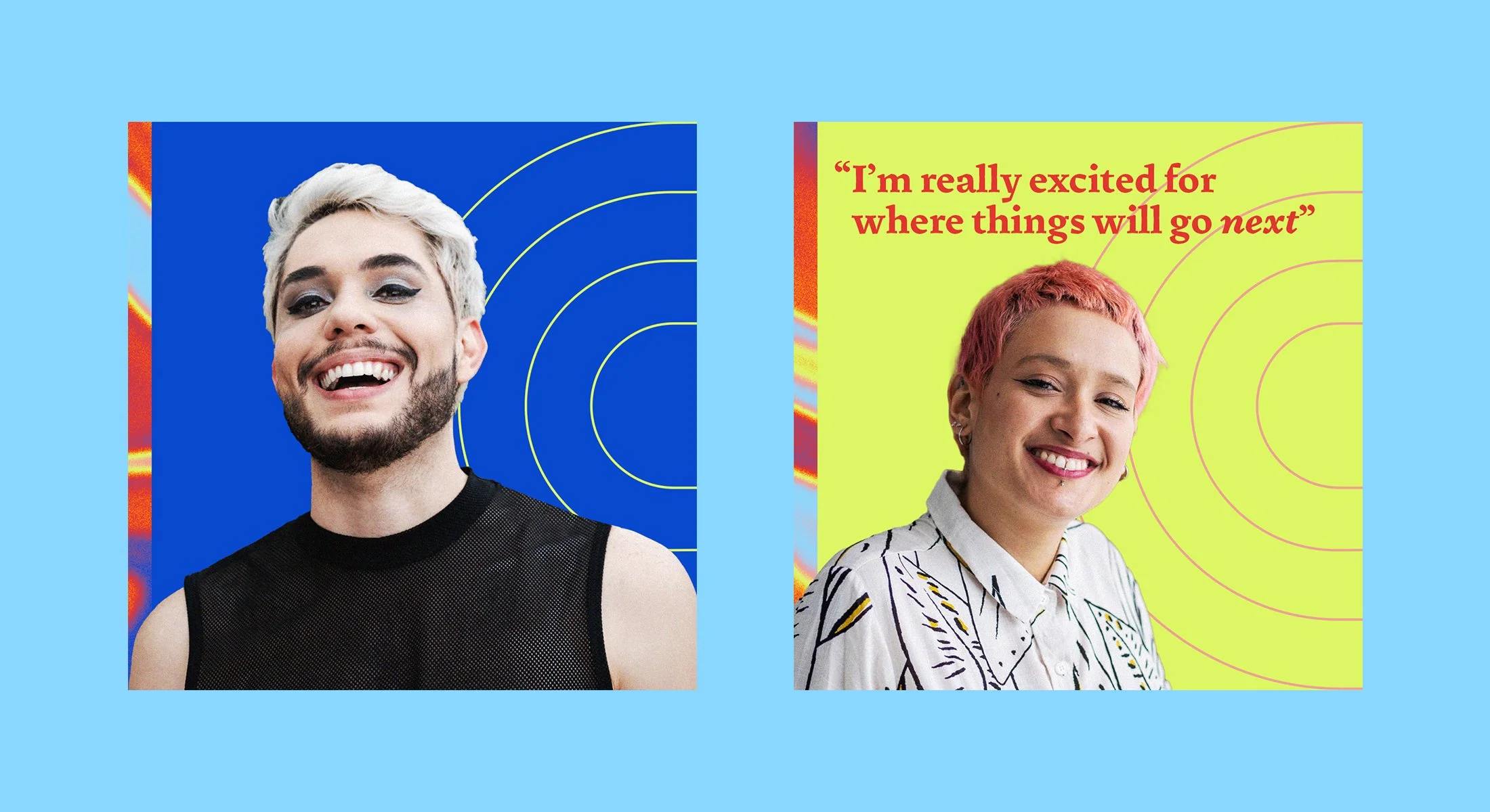
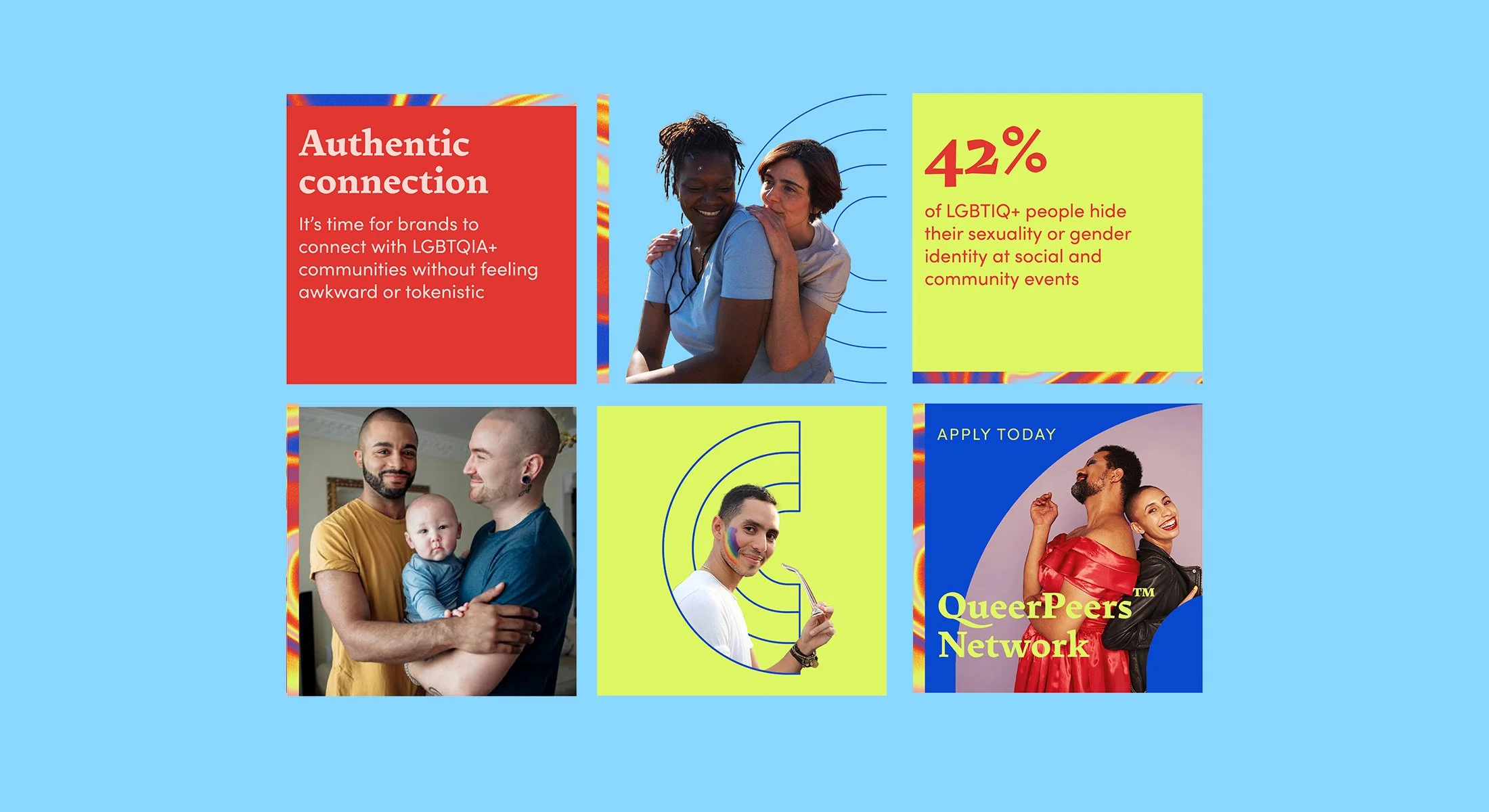
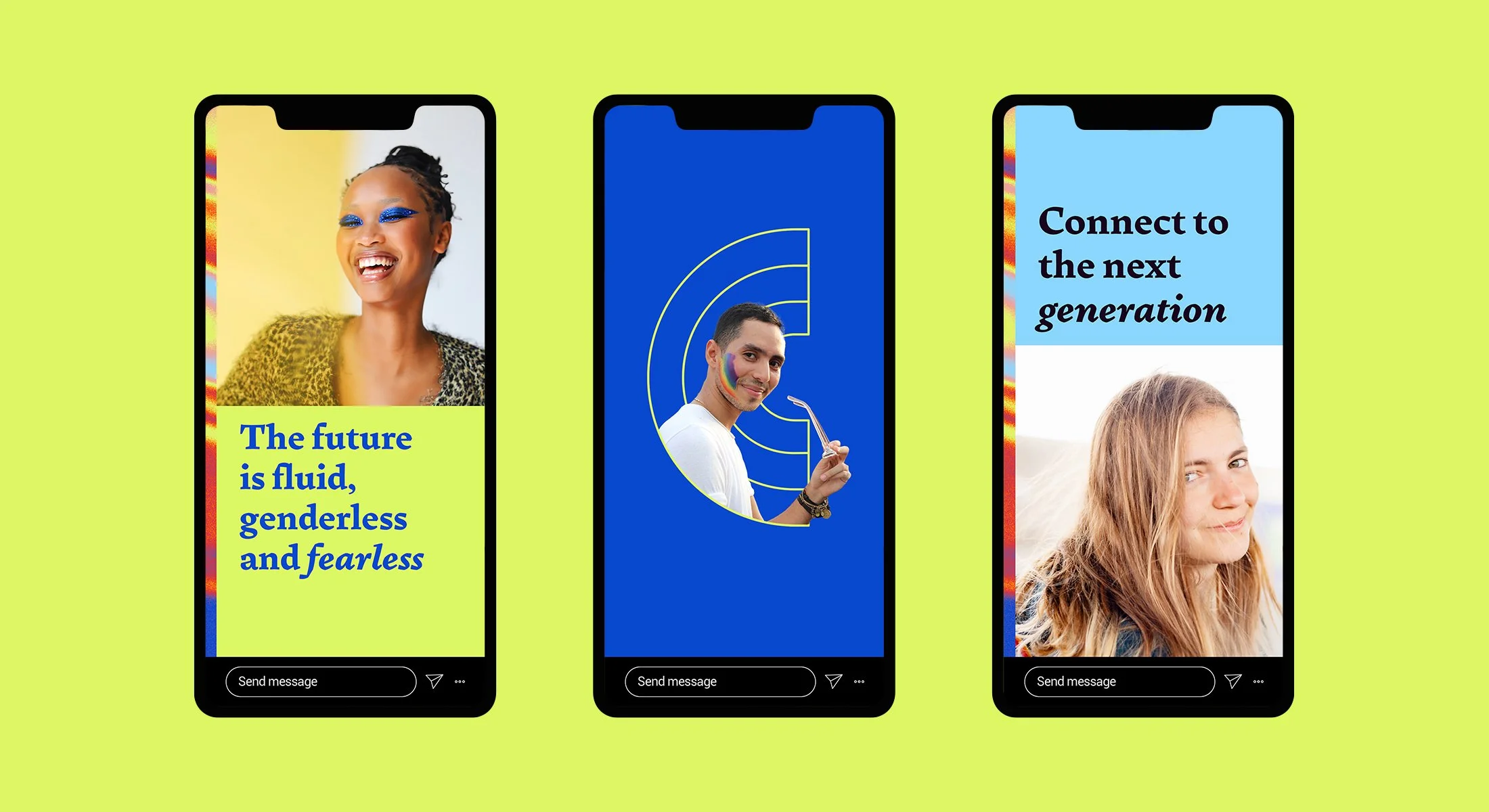
The photographic style is unmistakably They Connect by leaning into it’s positive, inclusive and confident values. It demonstrates joy and connects with the audience to celebrate cultural diversity.